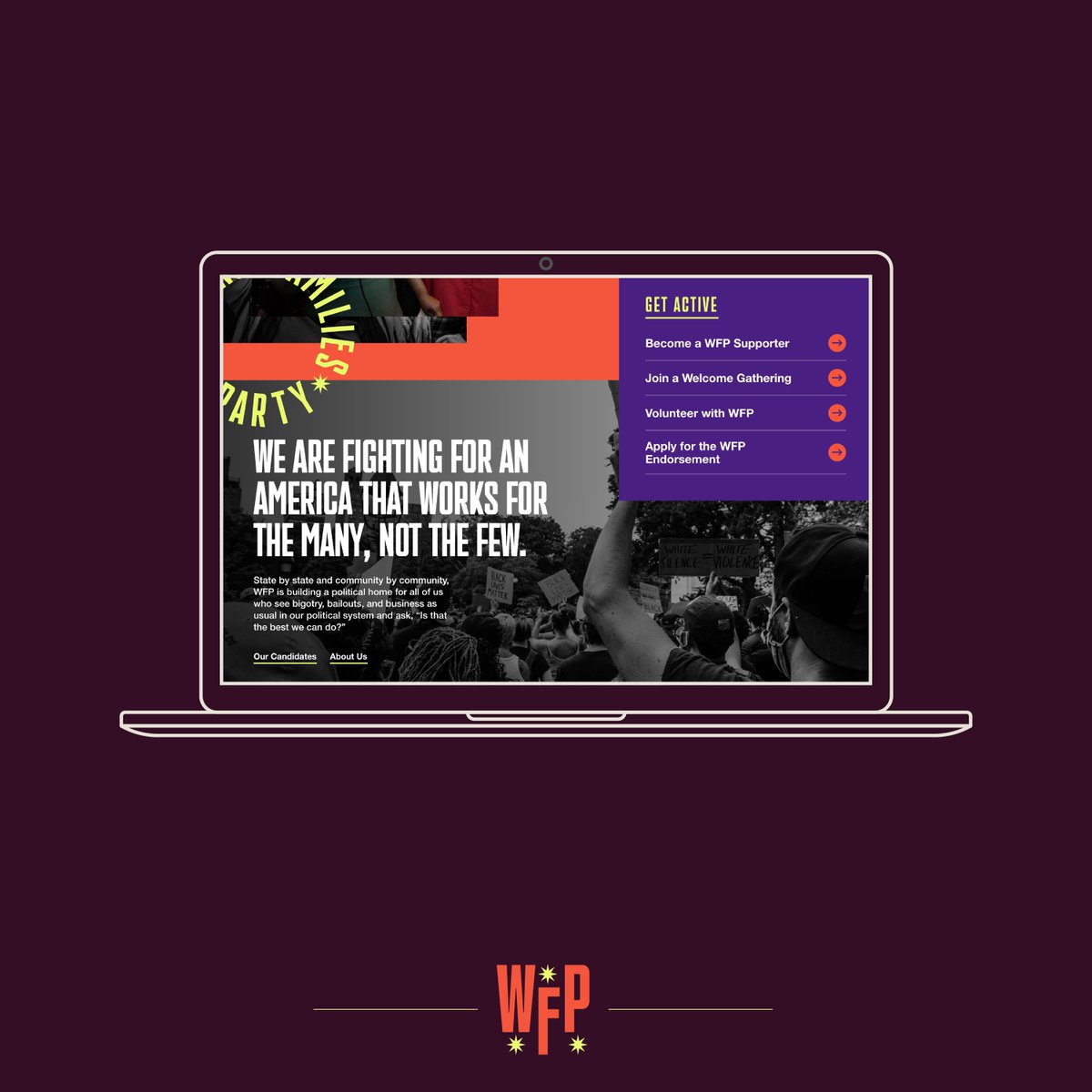
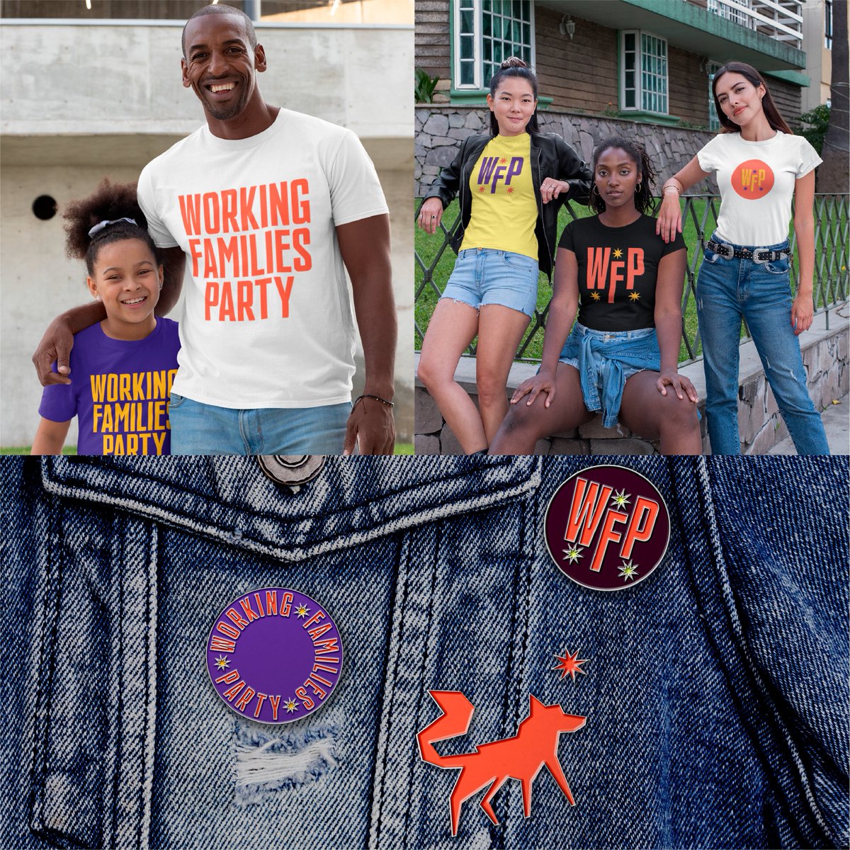
From fonts inspired by union strikes and Black resistance to colors from 60s protest art—our new brand (!) is a visual representation of past and future. We researched movement imagery, progressive iconography, and talked to our members about their vision.
Let& #39;s walk through it:
Let& #39;s walk through it:
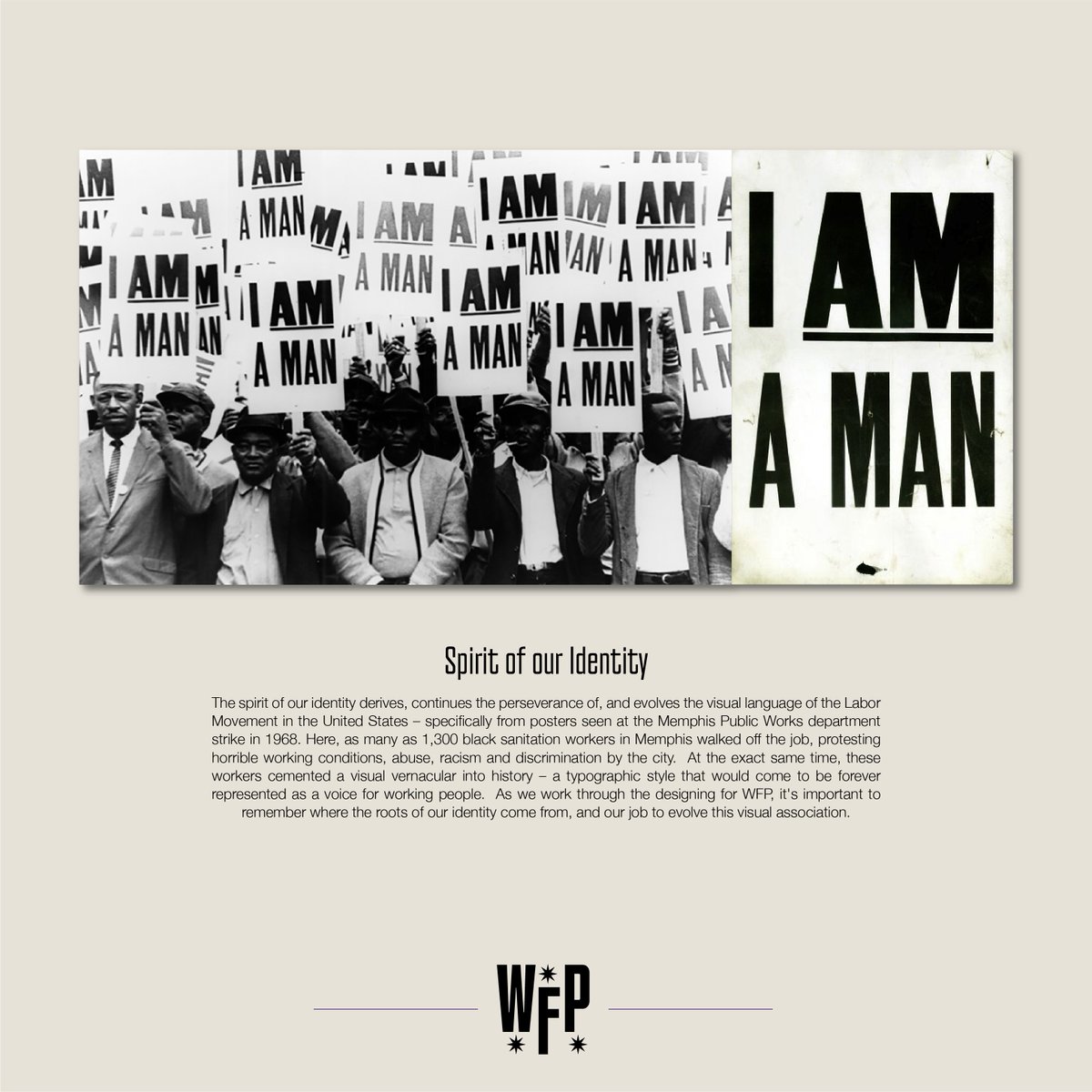
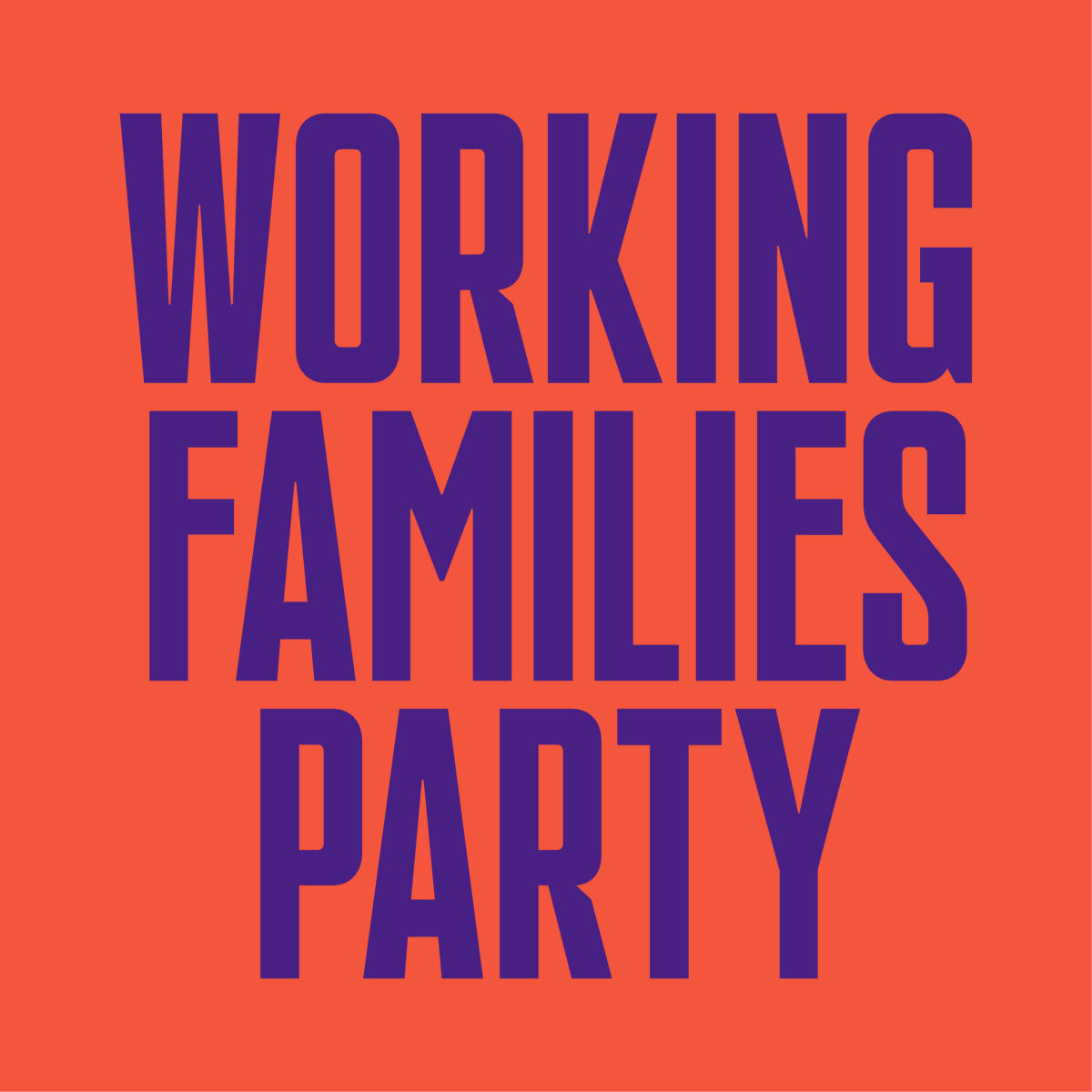
The font and wordmark are inspired by the "I AM A MAN" signs at the 1968 Memphis sanitation worker strike—and the boldness of the present day Black resistance that& #39;s transforming this country, forcing us to confront systemic racism, and fighting for economic justice.
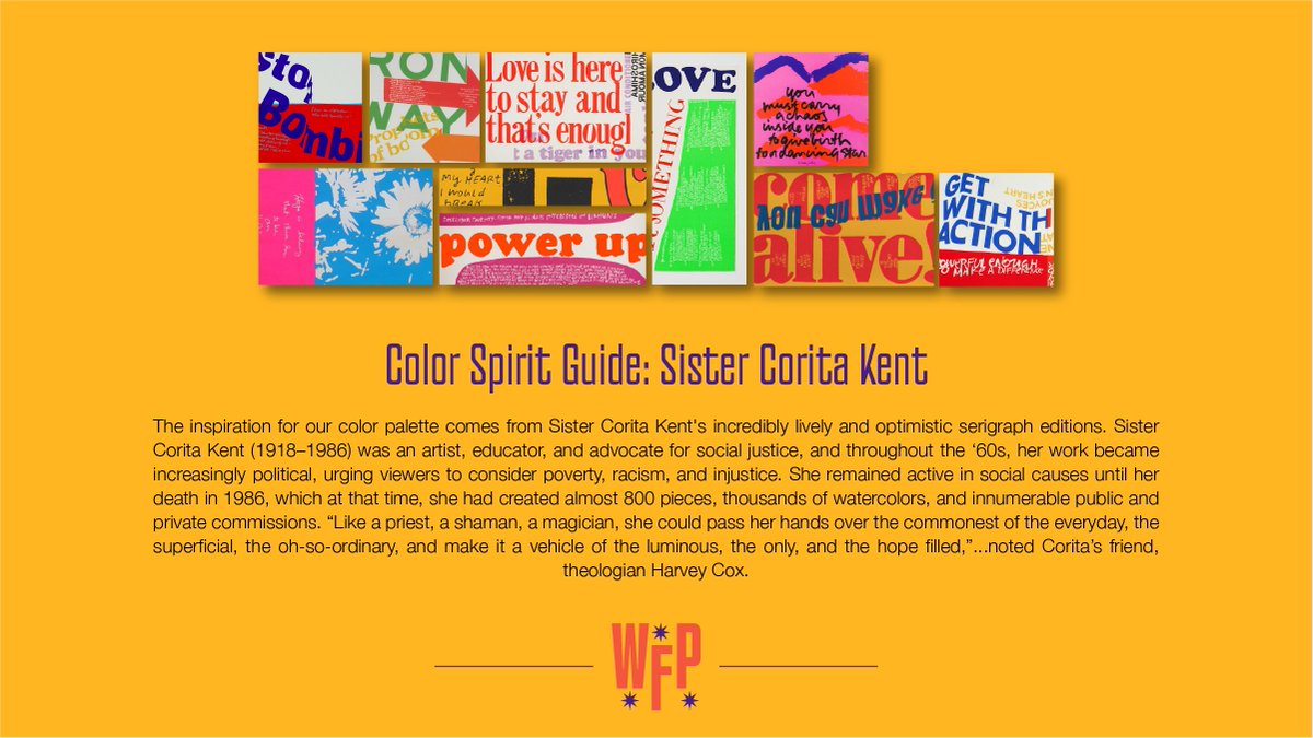
The inspiration for our colors comes from artist Sister Corita Kent—whose work in the ‘60s urged viewers to consider poverty, racism, and injustice. They& #39;re simple and intuitive, like our mission—with bold and interesting combinations, like the tactics we use to achieve it.
If you dig the new brand (and most importantly, the work we’re doing to build a multiracial movement working to make this a country for the many, not the few) check out our new website and take action now (and maybe buy a shirt while you& #39;re there): http://WorkingFamilies.org"> http://WorkingFamilies.org

 Read on Twitter